Inclusivity Comes to Gaming
Namco employee Toru Iwatani, who helped create the company's first few arcade game outings in the late 1970s, observed that most
arcade games at the time were violent and featured men as protagonists, which made the games and arcades heavily male-oriented and
seem to appeal to men only. Iwatani decided he wanted to create a cute character and enemies that would attract women too, and that
included implementing no violence. He started by looking through a children's story which involved an animal that protected
children by eating monsters that came for them.
Pizza Mind
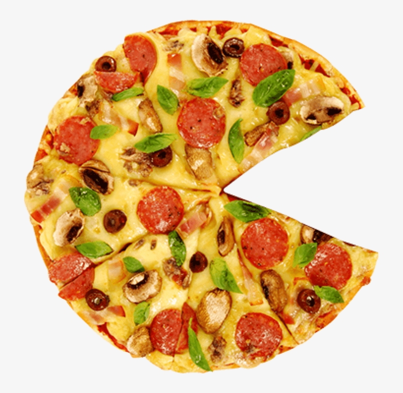
The most telling aspect of Pac-Man's creation is how his appearance was determined, which comes in two commonly accepted theories.
One is that he was developed when Iwatani ordered a pizza at a pizza shop and cut out a slice, inspiring the character's design.
The other was that he took the rather square Japanese "kuchi" symbol, meaning "mouth", and modified it into Pac-Man's shape. What's
odd is that he confirmed each was true in individual interviews, while other statements suggest one was true and the other wasn't.
And in keeping with his goal to attract women to the game, he surmised that they like to eat cake or other dessert, after dinner.
This became the premise for the game, and so Iwatani did research on the keyword "taberu", which means eating, coming across an
image of a pizza with a slice cut out, hence the round, constantly chomping character we know and love.
Pucking Around
In searching for the new character's name and objective, Iwatani decided it should consume food that's found in every direction all
over the screen. He then amended it by putting everything in a maze so the simple objective would be obvious to the player. Next was
the search for a name for the character. Citing the Japanese slang term "pakku-pakku" for the opening and closing of a person's mouth
when eating, Iwatani chose to call the yellow circle...Puckman!
But wait, I hear you ask, wasn't he called Pac-Man? Well, not initially, but we'll revisit that.
The Colorful Unfriendly Ghosts
Another important point of the game's development was that Toru Iwatani took a bunch of inspiration from Japanese comics and cartoons
he was interested in as a child. He decided that the enemies that Puckman would avoid should be ghosts, taking after Obake No-Q-Tarou
and Casper. He also decided on a powerup that allows Puckman to momentarily chase the ghosts like they were chasing him, and eat them
for extra points without the fear of death, like Popeye would eat spinach that makes him strong and attack Bluto. In addition, bonus
items were eventually introduced and placed below the ghost pen in the middle of the board, including the Galaxian flagship. This
marked the beginning of a running gag in Namco's games, where icons and characters from their earlier games would make cameo
appearances in their later games.
Throughout the course of the game's development in 1979, Iwatani's other pinball-themed games Bomb Bee and Cutie Q were released. And
also that year came blockbuster Galaxian, which was the first arcade game to boast color video output. Other arcade games by that
point had to put strips of plastic on the monitor to simulate color. He took this opportunity to design the five characters in
Puckman with pretty colors to, again, appeal the game to women as well. It was at this point that Puckman received his trademark
yellow color, and the ghosts were colored red, pink, cyan, and light orange.
Programmer Ready!
With the framework of the game complete, it was time to program. As actual programming went on throughout 1979 and early 1980, a whole
lot of changes were made to perfect the feel and difficulty of the game, one of the most important aspects being the behavior of the
ghosts. It wasn't until their movement patterns were finished that they also received names of their own to define them, which at first
were based on their behavior or color:
Oikake (pursuit/chase) / Akabei (red)
Machibuse (ambush) / Pinky (well... pink)
Kimagure (whimsical) / Aosuke (blue)
Otobuke (obstruction) / Guzuta (from guzuguzu = slow)
???
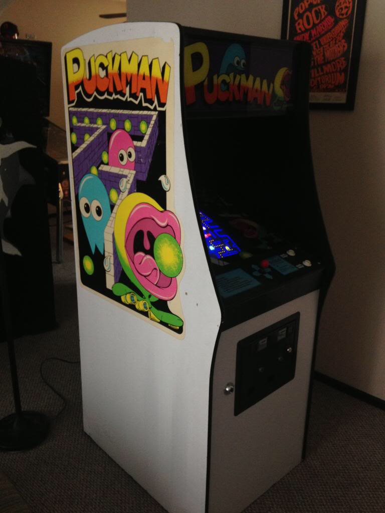
The original Puck-Man version of the game went through a lot of changes from an aesthetical standpoint. As seen below, it was very
differently and basically designed. To start with, the cabinet is pure white with black edges. Most prominently is Puck-Man's early
design, giving a rather unsettlingly graphic look of his mouth and having feet with rollerblade wheels. Behind him are ghosts of a more
basic and cartoony design. The bezel (the picture around the screen) also shows a maze design with the early Puck-Man and ghosts.
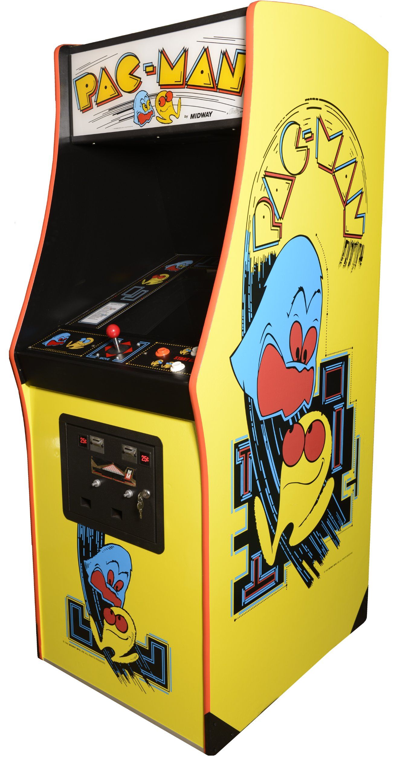
Pac-ing It in
Puck-Man was released on May 22, 1980 in Japan, becoming a moderate success. Determined to bring the yellow circle to the States, Namco
got in contact with one of the region's coin-op distributors Midway to release it there under their brand. But in doing so, Midway
sought to make some changes to the game. First was the name, Puck-Man. You see, vandalism was common in arcades in North America.
Juveniles tended to draw, carve, and paint over game cabinets in certain ways to spell nasty things. Keeping the name Puck-Man would
attract vandals to easily carve or draw over the "P" to make it an "F", and you can probably surmise the colorful title it would
produce. So Midway changed the game's name to the globally-recognized Pac-Man! The next thing would be the cabinet design. To make it
stand out more from other arcade games, Midway redesigned the cabinet with a four-color palette that makes it easier to manufacture and
overall appeal to the region's audience.
One more change that was made was the ghosts' names. Obviously, being that this was a different audience, Midway gave the ghosts English
names:
Shadow / Blinky
Speedy / Pinky
Bashful / Inky
Pokey / Clyde
And so, Midway released Pac-Man in American arcades in October.